People waste food because they can't figure out what to cook with what they already have. I designed and built an AI-powered recipe app around this problem, from research through to a live product serving real users.
Existing recipe apps ask "what do you want to cook?" But most people start with a different question: "what can I make with what I already have?" That mismatch leads to frustration. You scroll through recipes that need ingredients you don't have, eventually giving up and ordering takeaway.
Add allergies, dietary needs, and the "I only have 20 minutes" constraint, and the problem compounds. I wanted to design a product that starts from the fridge, not from a search bar.
I spoke with 12 people (friends, family, and contacts) across different cooking skill levels and dietary needs. These were informal conversations, not formal user interviews. I also analysed competitor apps (Supercook, Whisk, Yummly) to map feature gaps and understand where they fell short.
Every competitor requires manual typing. Users gave up after entering 3-4 items. The input method IS the product's bottleneck.
Users with dietary restrictions didn't trust generic recipe filters. They needed explicit confirmation that a recipe was safe for them, every single time.
Beginner and intermediate cooks didn't want a list of steps. They wanted someone to walk them through it, answer questions, and tell them when something looks right.
I mapped the existing journey vs. the target experience. The goal: collapse a 15-minute frustration loop into a 60-second flow from fridge to recipe.
I followed a compressed design process, testing at each phase with people around me before moving to the next. Working solo meant I could iterate fast, but it also meant I was designer, developer, and tester at the same time.
I tested with people around me at each phase. Not recruited participants, but friends and contacts willing to try the product and give honest feedback. Small samples, but the patterns were clear. The biggest changes came from watching where people hesitated, not from what they said.
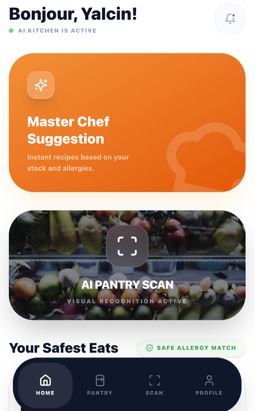
If typing ingredients kills engagement, remove typing. I designed a scan flow where users photograph their fridge or pantry, and Google Gemini's vision API identifies ingredients automatically.
The UX challenge was managing AI uncertainty. I added an editable ingredient list after scanning so users can correct mistakes before generating recipes. This built trust without adding friction.
→ In testing, scan-to-recipe took under 15 seconds compared to 2+ minutes of manual entry in competitor apps I benchmarked.
Most recipe apps bury dietary preferences in settings. I surface them at the moment of decision: a quick modal before generating recipes lets users set cooking time, allergies, and dietary needs per session.
Allergies are pre-filled from the user's profile but can be adjusted. This respects the "cooking for guests" scenario where today's constraints differ from your default ones.
→ In usability testing, participants with allergies described feeling "safe" using the app for guests, a trust signal that competitors' buried settings pages didn't provide.
The guided cooking mode includes a floating AI chef button. It proactively offers help every 2 steps and answers contextual questions ("Is this too brown?", "Can I substitute butter?").
The first message is a free welcome with no API cost. This gives every user a taste of the AI assistant before they decide to engage, reducing the barrier to interaction.
→ During live testing sessions, most participants engaged with the AI chef at least once. One tester described it as "having a patient friend in the kitchen." Sample size is small, so this needs more data to validate.
Being the only person on this project meant every technical choice was also a design choice. I picked tools I could move fast with, and kept the AI costs low enough to sustain the product solo.
Component-based UI with full type safety. Tailwind CSS for rapid iteration. Framer Motion for cooking animations.
Vision API for ingredient scanning. Text API for recipe generation and cooking chat. Rate-limited per subscription tier.
13 edge functions handling auth, AI calls, subscriptions, and email. Row-level security on all tables.
3-tier model: Free (2 meals), Standard (7 meals), Premium (unlimited). Webhook-driven lifecycle management.
EN, TR, ES, PT, RU, ZH, IT, FR, DE. Browser-detected with manual override. AI responds in the user's language.
Photo upload, star rating, and shareable dish pages with dynamic OG meta tags for social previews.
CookFromHere is live with real users, payments working, and 9 languages supported. But it's early. The user base is small and I'm still learning what works and what doesn't from real usage data. The numbers below are honest about the current stage.
Note: User and revenue numbers are small at this stage. I'm sharing the design process honestly rather than inflating early metrics.
The product is live, but "live" doesn't mean "done." These are the questions I'd need to answer with more users and more data before I'd call this validated.
I've tested with western-style fridges and pantries. Would the AI ingredient detection work for different food cultures, packaging, and storage styles? I don't know yet.
Early feedback is mixed. Some recipes are great, others feel generic. I need a proper feedback loop (star ratings, repeat usage data) to understand what "good enough" means for different cooking skill levels.
Payments work, tiers exist, but the user base is too small to draw conclusions about conversion or willingness to pay. The freemium model needs more time and more users to validate.
When you're also the developer paying the API bills, you design differently. Every feature gets weighed against cost, complexity, and maintenance. This made me a better designer. Not a more cautious one, but a more honest one.
Users don't blindly trust AI-generated recipes. The editable ingredient list after scanning, the visible allergy badges, and the "safe for you" confirmations all exist because early testers asked: "How do I know this is right?"
Supporting 9 languages affected button widths, text hierarchy, and even the cooking flow. German labels are 40% longer than English. This forced a more resilient, flexible layout from day one.
The post-cooking review flow, the guided cooking animations, and the proactive AI prompts were all added after watching real users interact with the first version. The best features came from observation, not assumption.
I made all design and development decisions alone. That means fast iteration, but also blind spots. The "informal testing with people I know" approach gets you started, but I'd want to work with a proper research process and diverse participants for the next phase.
I originally built a 4-step onboarding flow explaining AI scanning, dietary preferences, and the pantry feature. Testing showed most users skipped it entirely. I stripped it down to a single screen with one action: "Take a photo of your ingredients." Adoption improved immediately.
Early Gemini API responses sometimes suggested ingredients the user didn't have, or generated vague instructions like "cook until done." I had to add post-processing logic to validate recipes against the actual ingredient list and rewrite unclear steps. This took two weeks of iteration I hadn't planned for.
I launched in 9 languages simultaneously. In hindsight, I should have launched in English first, validated the core experience, then expanded. Some translations had UX issues I didn't catch until users reported them. Button text overflows, awkward recipe instructions, cultural mismatches in ingredient names.
Interested in working together?
I'm always looking for interesting design challenges. If you're working on something complex, I'd love to hear about it.