Redesigning London's oldest luxury car rental into a mobile-first concierge experience. Booking time went from 6 minutes to under 90 seconds.
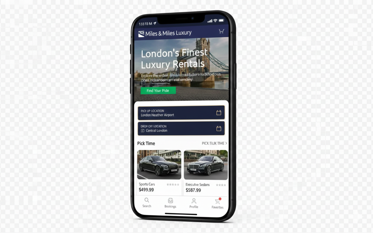
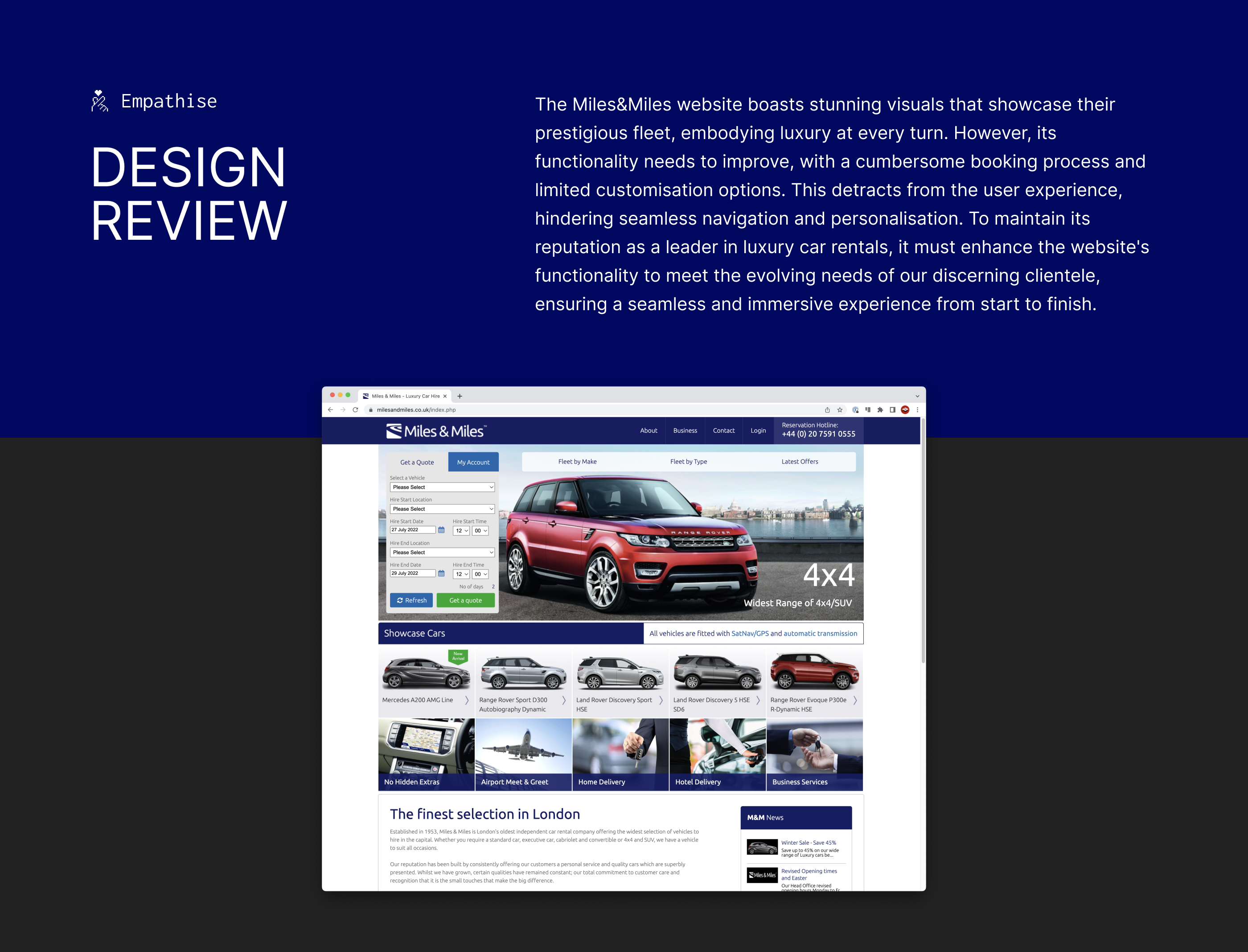
Miles & Miles has been London's premier luxury car rental since 1953. Their fleet includes Bentleys, Rolls-Royces, and Aston Martins, yet their booking experience was a desktop-only web form that felt anything but premium.
High-net-worth clients were abandoning bookings mid-flow. The business was losing revenue to competitors who offered smoother digital experiences. My brief: create a mobile-first booking experience worthy of the brand.
I interviewed 8 existing Miles & Miles clients and analysed competitor apps (Turo, Sixt, Blacklane). Three insights fundamentally shaped the design direction:
These users value their time above all else. They don't want to browse. They want to book in seconds and get back to their day.
For high-value transactions (£500+/day), users needed to see the driver's profile and real car photos. Stock imagery killed trust.
Frequent clients were frustrated re-entering preferences. They expected the app to "know them" like their favourite hotel concierge.
Needs a booking experience that takes seconds, not minutes, and remembers his preferences across trips.
"I shouldn't have to re-enter my billing details at Heathrow. My Uber knows my card, why doesn't this?"
Wants a car that matches the aesthetic of her events, with a personal driver who knows London.
"I need to know who's driving me. A profile photo and rating would go a long way."
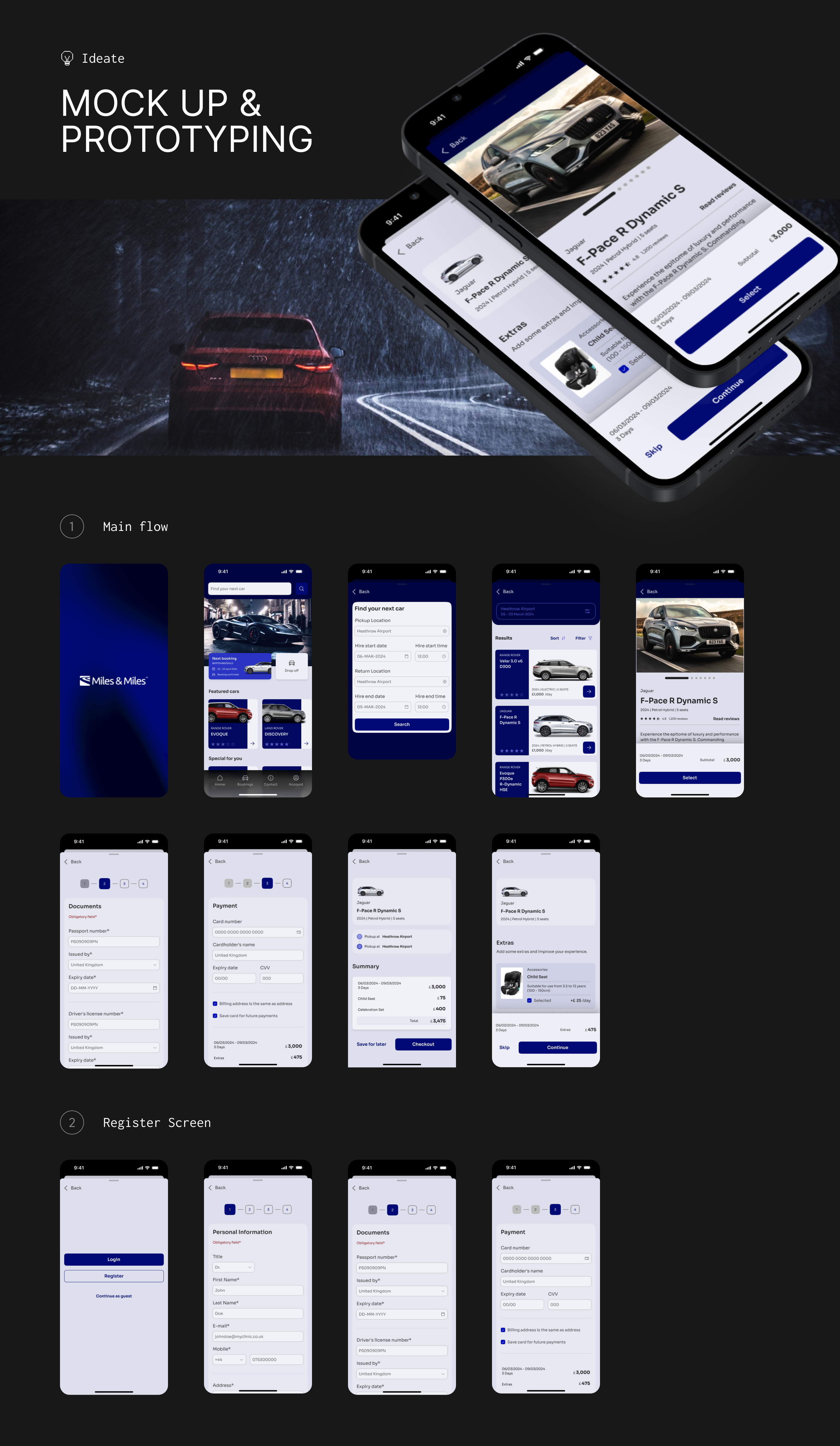
Rather than documenting every wireframe iteration, here are the 3 decisions that had the biggest impact on the final product:
The existing web form had 8 pages: vehicle type, dates, location, extras, driver preference, insurance, billing, confirmation. Research showed most users wanted the same configuration every time.
I collapsed this into 4 steps: Browse → Select → Personalise → Confirm. Driver and extras became an optional layer rather than mandatory steps. Returning users could skip straight to confirmation with saved preferences.
→ Reduced average booking time from 6+ minutes to 87 seconds in usability testing.
Competitors used thumbnail grids that made £800/day Bentleys look identical to £100/day economy cars. For a luxury service, the browsing experience IS the brand experience.
I designed full-width editorial cards with cinematic photography, transparent all-inclusive pricing, and curated "Concierge Picks", showing 3-5 vehicles instead of the full fleet of 47.
→ Users spent 40% less time deciding but reported feeling "more confident" in their choice.
Isabella's insight was crucial: for high-value clients, the driver matters as much as the car. But the business resisted adding driver profiles, citing privacy concerns.
The compromise: professional headshots, first names, years of experience, and a verified badge. No last names or personal details. This balanced trust with privacy.
→ "Chauffeur add-on" selection rate increased from 23% to 61% in the prototype test.
The visual language needed to feel like stepping into a Bentley showroom, not a tech startup. I used Imperial Navy for authority and Vibrant Green as the sole action colour, ensuring every tap target was immediately identifiable.
After 3 rounds of usability testing with 12 participants matching our target personas, the redesigned experience delivered measurable improvements across every key metric:
Usability testing with fake bookings only tells you half the story. If I had more time, I'd run a pilot with real money to validate whether the "trust signals" truly moved the needle on high-value bookings.
Several users mentioned wanting to book while driving. A Siri/voice integration could have made the experience truly hands-free. Something I'd definitely prioritise in a V2.
The biggest lesson: premium users don't want more features. They want fewer, better ones. Every element I removed made the experience feel more luxurious.