An AI-powered recipe app that turns your fridge contents into personalised meals. Designed, built, and shipped solo — from first sketch to production in 9 languages.
Every household faces the same friction: you open the fridge, see random ingredients, and can't think of what to make. Existing recipe apps expect you to search by dish name — but most people don't start with a dish in mind. They start with what they have.
Add dietary restrictions, allergies, and cooking time constraints, and the problem multiplies. The result: wasted food, wasted time, and defaulting to takeaway.
I interviewed 12 people across different cooking skill levels, dietary needs, and household sizes. I also analysed competitor apps (Supercook, Whisk, Yummly) to map feature gaps.
Every competitor requires manual typing. Users gave up after entering 3–4 items. The input method IS the product's bottleneck.
Users with dietary restrictions didn't trust generic recipe filters. They needed explicit confirmation that a recipe was safe for them, every single time.
Beginner and intermediate cooks didn't want a list of steps. They wanted someone to walk them through it, answer questions, and tell them when something looks right.
I mapped the existing journey vs. the target experience. The goal: collapse a 15-minute frustration loop into a 60-second flow from fridge to recipe.
I followed a compressed design sprint approach — validating each phase with real users before moving to the next.
I tested with real users at each phase. The biggest changes came not from what users said, but from watching where they hesitated.
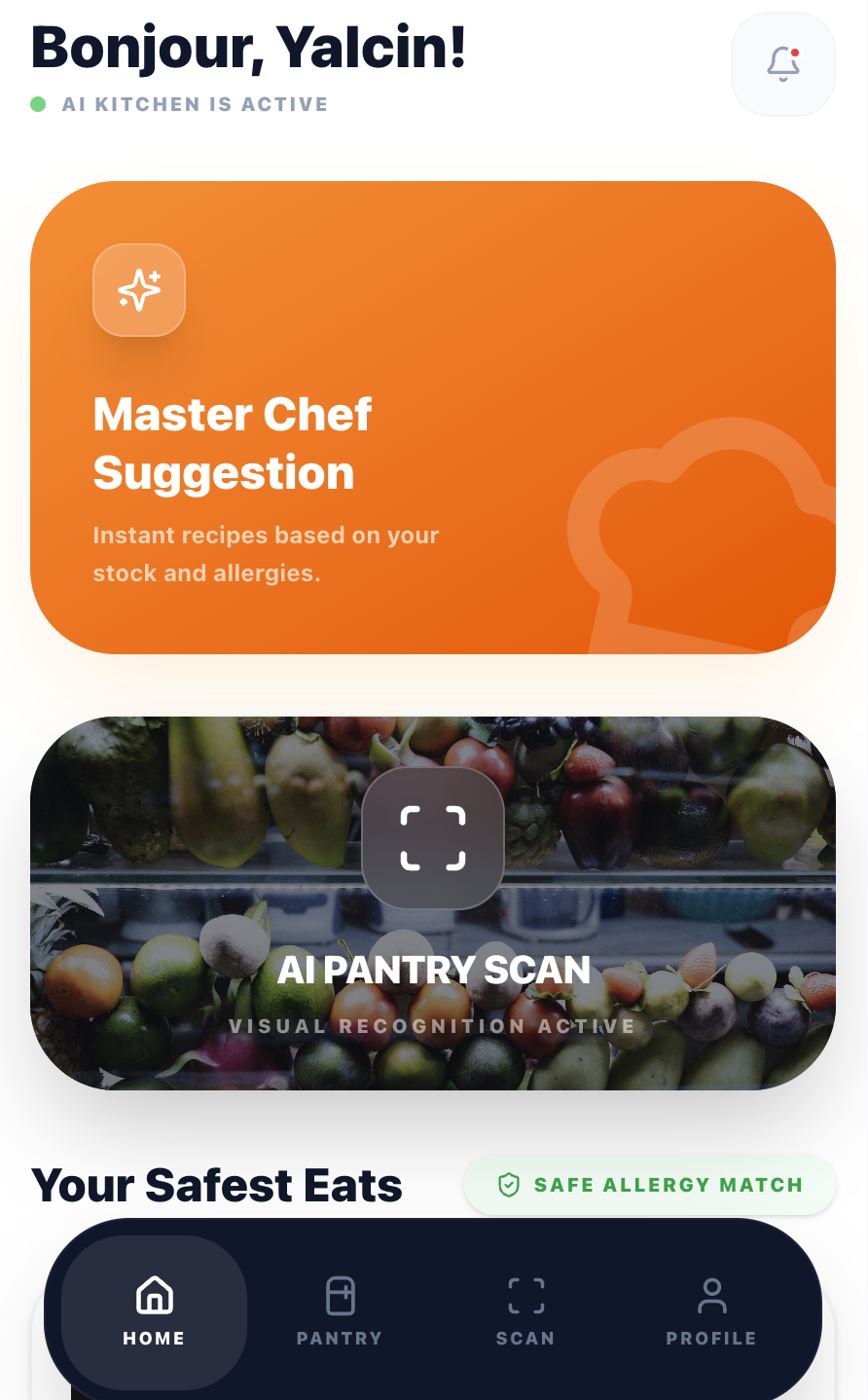
If typing ingredients kills engagement, remove typing. I designed a scan flow where users photograph their fridge or pantry, and Google Gemini's vision API identifies ingredients automatically.
The UX challenge was managing AI uncertainty. I added an editable ingredient list after scanning so users can correct mistakes before generating recipes. This built trust without adding friction.
→ Scan-to-recipe takes under 15 seconds vs. 2+ minutes of manual entry in competitor apps.
Most recipe apps bury dietary preferences in settings. I surface them at the moment of decision: a quick modal before generating recipes lets users set cooking time, allergies, and dietary needs per session.
Allergies are pre-filled from the user's profile but can be adjusted. This respects the "cooking for guests" scenario where today's constraints differ from your default ones.
→ Users reported feeling "safe" using the app for guests with allergies — a key trust signal competitors lacked.
The guided cooking mode includes a floating AI chef button. It proactively offers help every 2 steps and answers contextual questions ("Is this too brown?", "Can I substitute butter?").
The first message is a free welcome — no API cost. This gives every user a taste of the AI assistant before they decide to engage, reducing the barrier to interaction.
→ AI chef engagement rate: 68% of active cooking sessions. Users described it as "having a patient friend in the kitchen."
As the sole designer and developer, I made every architectural decision with UX in mind. The tech stack was chosen for speed, reliability, and cost efficiency within a $5/month AI budget.
Component-based UI with full type safety. Tailwind CSS for rapid iteration. Framer Motion for cooking animations.
Vision API for ingredient scanning. Text API for recipe generation and cooking chat. Rate-limited per subscription tier.
13 edge functions handling auth, AI calls, subscriptions, and email. Row-level security on all tables.
3-tier model: Free (2 meals), Standard (7 meals), Premium (unlimited). Webhook-driven lifecycle management.
EN, TR, ES, PT, RU, ZH, IT, FR, DE. Browser-detected with manual override. AI responds in the user's language.
Photo upload, star rating, and shareable dish pages with dynamic OG meta tags for social previews.
CookFromHere went from idea to production as a one-person operation: research, UX design, visual design, frontend development, backend architecture, payments, email, and internationalisation.
When you're also the developer paying the API bills, you design differently. Every feature gets weighed against cost, complexity, and maintenance. This made me a better designer — not a more cautious one, but a more honest one.
Users don't blindly trust AI-generated recipes. The editable ingredient list after scanning, the visible allergy badges, and the "safe for you" confirmations all exist because early testers asked: "How do I know this is right?"
Supporting 9 languages affected button widths, text hierarchy, and even the cooking flow. German labels are 40% longer than English. This forced a more resilient, flexible layout from day one.
The post-cooking review flow, the guided cooking animations, and the proactive AI prompts were all added after watching real users interact with the first version. The best features came from observation, not assumption.